Users will contribute to increasing the efficiency of the transportation network by providing up-to-date information on the state of the roads, which will help to avoid traffic congestion and problems such as potholes, roadblocks, and street closures. The application has an interaction system between users, where they can answer questions from visitors and doubts from other users, by selecting a point on the map.
In addition, a system of moderators has been implemented, assigned by the application, who have privileges to edit and delete reports, and who are selected based on their experience and number of moderators in the area.
Master Creationz is a Top UI UX Studio In India specialising in user interface (UI) and user experience (UX) design for digital products. They have been approached by a client with specific requirements regarding the look and feel, color scheme, and design elements for their project. This case study outlines the process followed by Master Creationz to meet the client’s expectations and create a cohesive and visually appealing design.
The design elements should follow a consistent style throughout the project.
Arrows, icons, and typography should harmonize and create a cohesive experience.
Design elements used in one part of the project should be carried over to other sections for consistency.
2. Color Scheme:
Corporate colors should guide the design without overpowering it.
Orange used in buttons (CTAs) should be replaced with colors from the color palette.
Purple is proposed as the primary color, with minimal use of gradients.
3. Typography:
Montserrat bold is the main typography for titles and main communications.
Open Sans is the secondary typography for paragraphs and other text.
Design Process:
1. Understanding the Requirements:
We held initial discussions with the client to gain a thorough understanding of their vision and objectives. They clarified specific design preferences, the desired tone, and the target audience for the project.
2. Look and Feel:
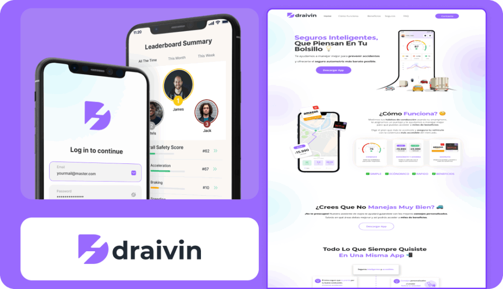
Based on the client’s requirement for a cohesive design, we developed a design concept that incorporated rectangular icons with pointed corners. This design element would be consistent across the project, from the landing home screen to the footer. By ensuring visual continuity, users would have a seamless experience.
3. Colour Scheme:
We proposed using a purple color palette while focusing on full shades to avoid overwhelming users. We suggested minimizing the use of gradient colors, reserving them for specific use cases. This approach would create a clean and minimal look and feel.
4. Typography:
Keeping the client’s preference in mind, we selected Montserrat bold as the primary typography for titles and main communications. This font choice added visual impact and complemented the design. For paragraphs and other text, we recommended using Open Sans, which provided legibility and readability.
5. Design Iterations:
We created multiple design iterations based on the proposed concept, color scheme, and typography. They applied the new colors, ensuring the absence of orange throughout the screens. Titles were predominantly styled with a combination of purple and black, with purple used selectively to emphasize key words in the text.
6. Minimal and Clean Communication:
To fulfill the client’s requirement for minimal and clean communication, we strategically placed design elements to avoid overwhelming users. They ensured that the design conveyed information quickly and clearly, facilitating user understanding.
Deliver
By following the client’s requirements and design guidelines, we successfully developed the Draivin app and web platform for our client. The design achieved a consistent and cohesive look and feel throughout the application.
The purple color palette, minimalistic design, and careful typography implementation created an intuitive and visually pleasing user experience. The final product aligned with the client’s vision of a clean and simple solution that effectively communicated their car rental services.
For our team, this project was a truly enjoyable experience. The process flowed smoothly, and the client was open to all our ideas, which made decision-making seamless. We were able to bring every feature to life without any major hurdles. It was a rewarding journey, filled with interesting challenges that allowed us to explore creative solutions and refine our approach.